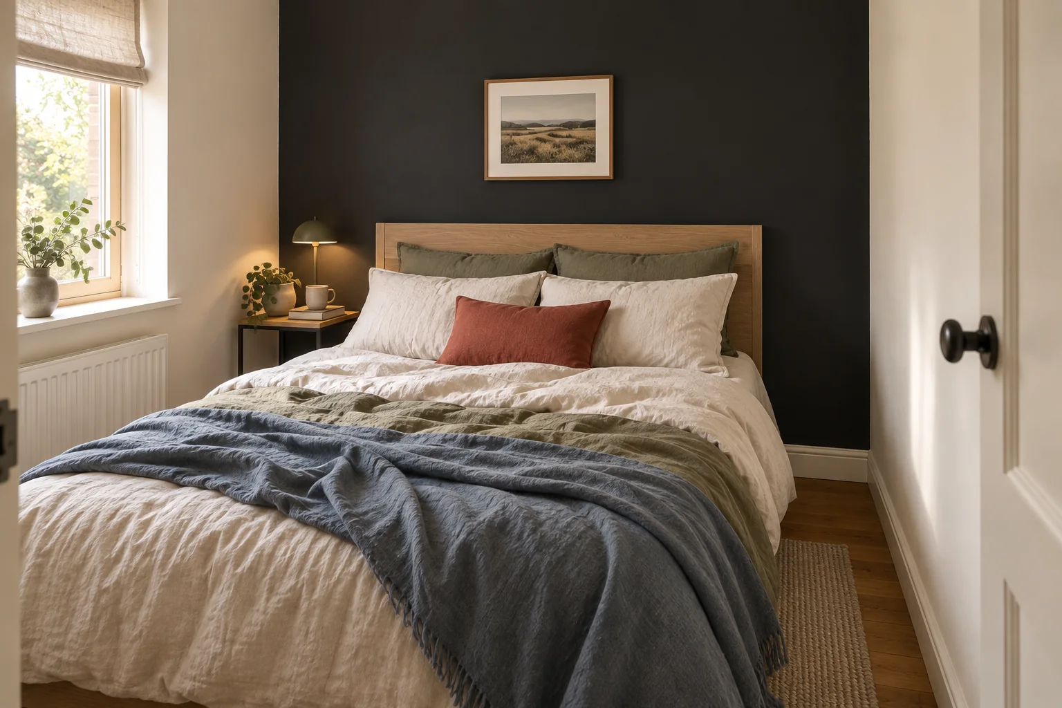
A black bedroom wall can give a small room a clear center, especially when the color sits behind the bed. In the wrong setting, though, it can look abrupt beside pale trim, swallow the outline of a dark headboard, or feel much heavier at night than it did in an inspiration photo.
Room size alone will not answer the question. Test a large field of black on the intended wall with the bed and fixed finishes still in view. Look at it under the light you normally use, then compare it with one softened dark color before buying the final paint. If neither test improves the bedroom, leave the wall as it is.
Jump to a section
01
Give the wall a specific job
A dark wall is easier to justify when it solves a visible room problem. It might anchor a bed that seems to float against a long pale wall, define an alcove, or make an intentionally low-light bedroom feel more settled.
Sometimes an empty wall is fine. If the room already has a clear center, painting one surface black may add contrast without improving the arrangement. A larger piece of art, a wider headboard, or bedding with more visual weight may be enough.
Before choosing paint, finish this sentence: "The dark wall will help this room by..."
A useful answer might be:
- giving the bed a stronger background;
- giving an awkward recess a clear boundary; or
- making the room's existing low-light mood feel intentional.
If the only answer is that the wall looks bare, test a less permanent solution first.
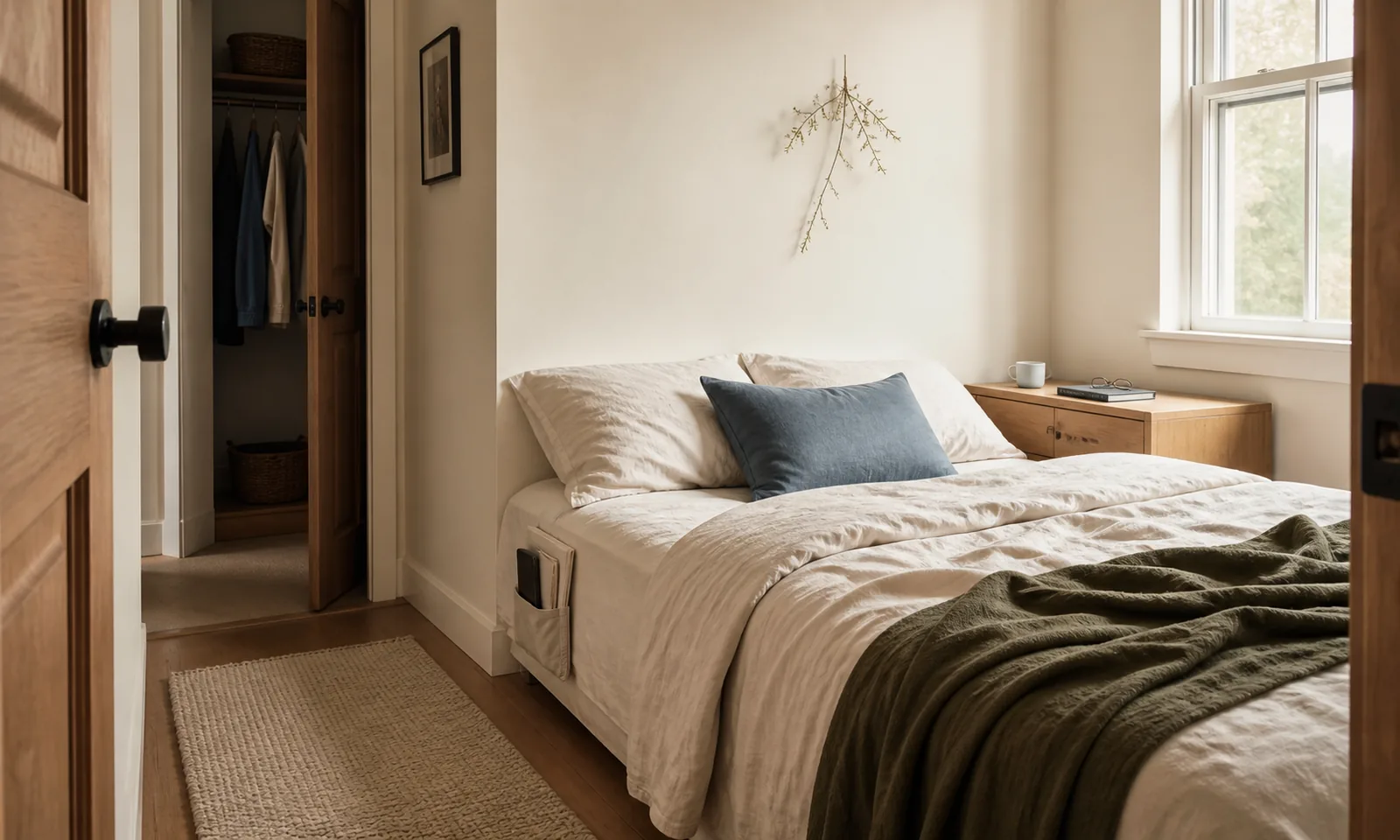
If the bedroom also lacks room for a nightstand, solve the bed's practical needs separately with our guide to nightstand alternatives before adding a dark wall for visual weight.
02
Choose a wall with a clear stopping point
The wall behind the bed is the obvious first candidate because the bed is usually the bedroom's largest object. Still, it is not the right wall in every room.
Stand in the doorway and look at the complete surface. A dark wall tends to read more deliberately when its edges meet clear boundaries such as corners, trim, or built-ins. A wall split into narrow pieces by doors and windows may look busier once the contrast increases.
Then sit or lie where you normally use the room. From bed, the proposed wall may be mostly out of sight, while a dark wall opposite becomes the view you wake up to. Choose the wall that improves these everyday views, not just the photograph taken from the doorway.
Check the awkward edges too. If the painted area stops beside an open closet, turns onto a short return, or meets a very different adjoining color, include that junction in the test. A clean rectangle in a phone mock-up can feel disconnected once the real edges are visible.
03
Test a large dark field in the room
A small chip can narrow the options, but it cannot show what a broad area of contrast will do beside the bed. Go bigger. Paint a large piece of white foam-core board or another sturdy, movable surface, or use a large temporary color sample from a paint manufacturer. Keep it close to the trim, floor, adjoining wall, and headboard so you can judge the relationships together.
Benjamin Moore recommends testing larger swaths on movable foam-core board, then viewing them from morning to evening in natural and artificial light. Its liquid samples represent color, but they are not the final wall coating. The finished appearance can vary with the selected paint product, sheen, surface, application, lighting, and viewing angle.
Leave the sample in place through an ordinary day. Look at it in the morning, later in the day, and with the lamps you normally use before sleep. Take a photograph from the doorway at each point if it helps you compare, but judge the room in person too. Benjamin Moore notes that monitors and printers can display paint colors differently, so a digital preview is a useful shortlist tool, not proof of the final result.
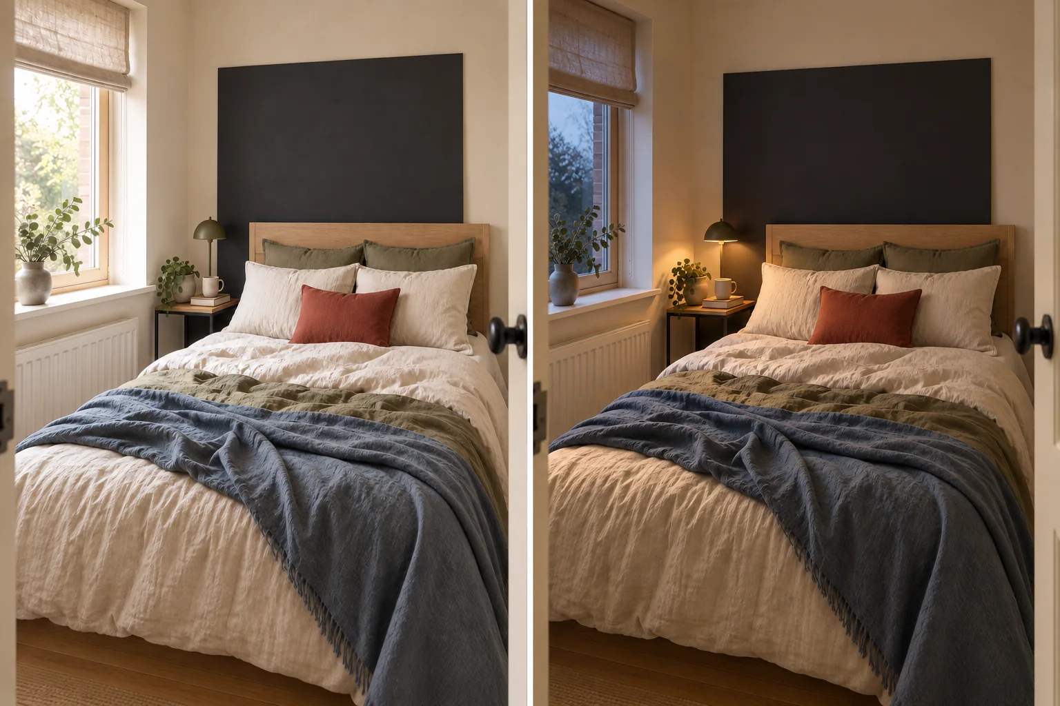
Pay attention to what changes. The sample may feel connected to the bed in daylight, then severe around the edges once the lamps come on. Judge that change against how you actually use the bedroom instead of asking whether black is generally good or bad for a small room.
04
Keep the bed and fixed finishes in the test
Do not clear the bedroom into a neutral photo set. The wall has to work with the bed, floor, trim, curtains, and storage furniture that will remain after painting.
Start with the headboard. Against black, a dark headboard may create a quiet, nearly continuous shape or lose the outline you like. A pale timber, upholstered, or metal bed may become much more prominent. Either effect can work. You simply want to discover it before the whole wall is painted.
Keep the sheets, quilt, and pillows you use most often on the bed during the test. A few small cushions cannot do all the work of connecting a severe dark wall to the rest of the room. If the test needs softening, try a substantial existing surface such as the duvet, curtains, rug, or headboard before buying a collection of little accents.
Trim changes the character of the idea too. Pale trim may give the black wall a strong graphic edge. Lower-contrast trim may let it sit more quietly. You do not need to repaint the trim as part of this decision, but you do need to see the existing trim beside the sample.
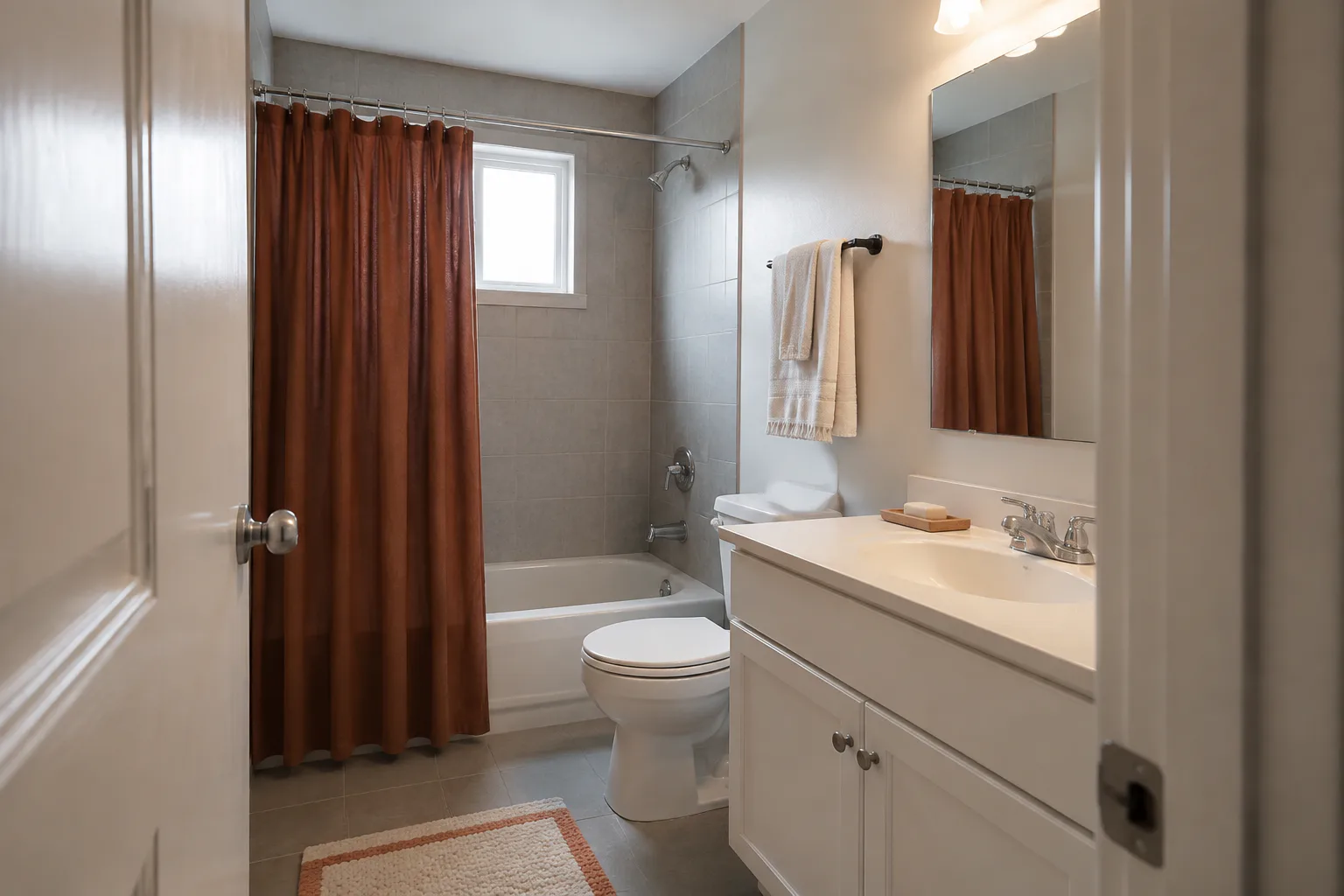
The floor and large furniture matter even when they do not touch the wall. Dark timber, gray carpet, warm floorboards, and a glossy white wardrobe will each change the surrounding contrast. Use the same room-first approach described in our guide to working with fixed gray bathroom finishes: judge the new color beside what cannot or will not change.
05
Compare black with one softened dark
Test one black and one near-black color at the same scale. Choose the alternative from something already present in the bedroom. A charcoal might relate to gray upholstery, a brown-black to timber, or a very dark green or blue to the bedding or curtains.
Forget which swatch seems safer or more fashionable. The useful comparison is how each one handles the room's existing colors and contrast.
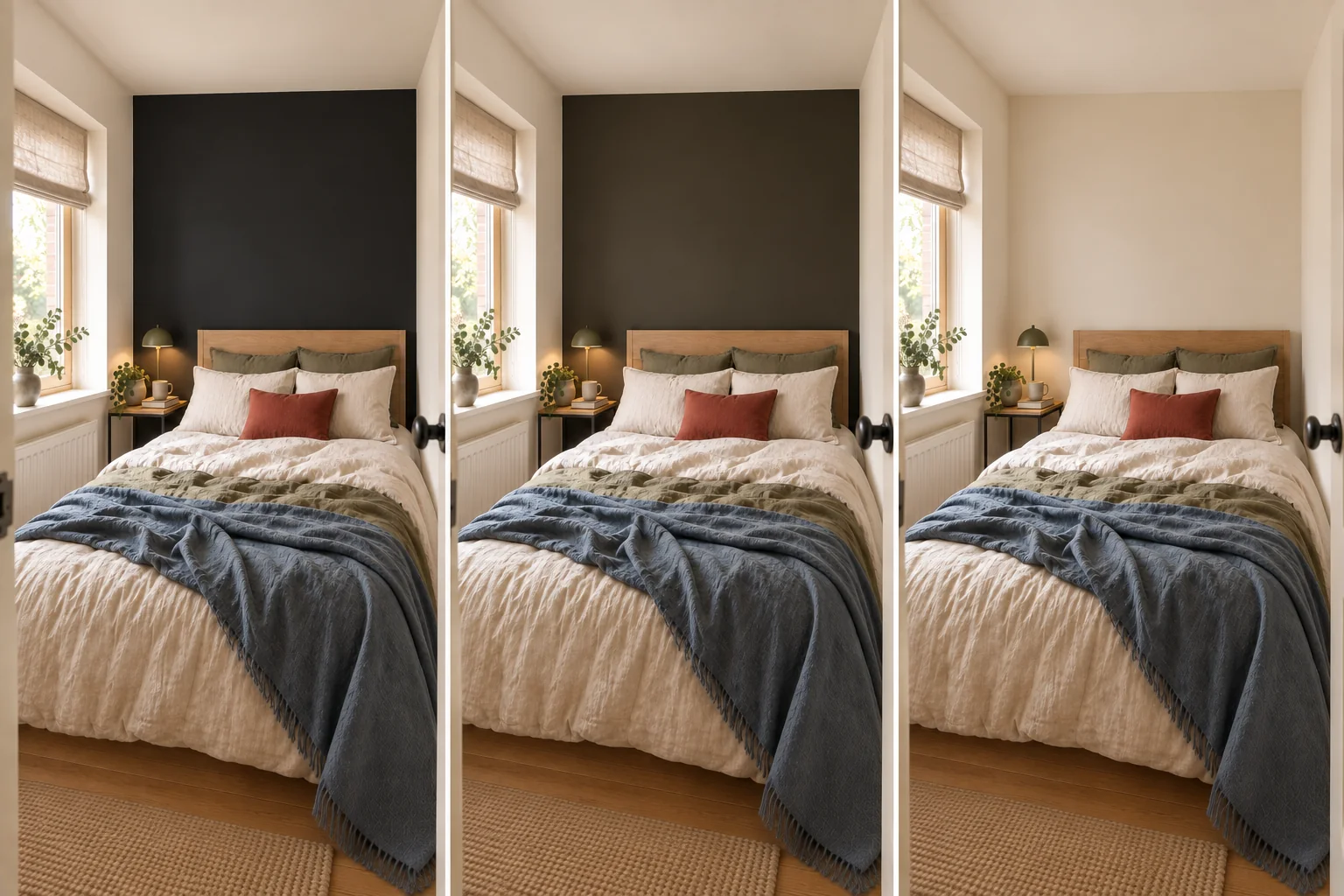
Black may give the bed a crisp, definite background. The softened color may offer similar depth while connecting more naturally to the floor or textiles. In another room, the near-black may look muddy while the cleaner black gives the arrangement the clarity it was missing.
Move both samples through the same positions and lighting conditions. Do not test black on the bed wall in daylight and the alternative on a side wall at night. Keep the conditions consistent enough that you are comparing the colors rather than two different views of the room.
If neither color works across the whole wall, try a smaller area only when the room already supplies a natural boundary, such as a true recess. Avoid inventing a floating painted rectangle merely to save the original plan.
06
Make the decision from more than one viewpoint
A dark wall has to work in daily life as well as in its best photograph. Check it from the doorway, beside the bed, and during the hours when you use the bedroom most.
From the doorway, check whether the wall creates a useful destination for the eye or seems detached from the rest of the room. From bed, notice whether the surrounding surfaces feel calm enough for daily use. At night, make sure the normal lamps still support reading, dressing, and finding stored items.
Photographs can help you compare the options after the samples come down. They are also useful for spotting a wall that stands alone because the dark color appears nowhere else. If that happens, first repeat a little of the color in something already useful, perhaps a frame, lamp base, or textile. Do not keep buying accessories until the wall seems justified.
07
Paint, revise, or leave the wall alone
Paint the wall
Paint the wall when its boundaries are clear, the bed remains distinct in the way you want, and the color still feels right in daylight and under the bedroom lamps.
Revise the idea
Revise the idea when the test shows promise but pure black feels separate from the room. The better answer may be the softened dark, a real alcove instead of the full wall, or a little more connection through bedding and art you already own.
Leave the wall unpainted
Leave the wall unpainted when the test makes the room less comfortable, causes the bed to lose needed definition, or works only in one carefully staged view. The test has still done its job: it saved you from painting a wall that did not suit the room.
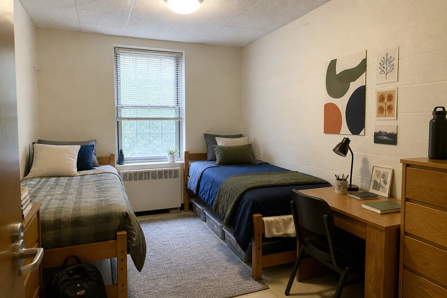
If you rent, read the lease and house rules before painting. Ask the landlord or property manager for written approval that covers the color, finish, and any move-out restoration. If paint is not allowed, the permission-first alternatives in our guide to decorating dorm walls without risking the paint can help you test a darker backdrop without treating every wall as adhesive-safe.
Once you decide to paint, use a coating intended for the surface and follow its label. The EPA recommends bringing in outdoor air and using extra ventilation while painting. Do not assume a low- or no-VOC label makes ventilation unnecessary.
Keep the sample up through an ordinary morning and evening. If the wall still improves the bedroom with the bed made as usual and the normal lamps switched on, you are ready to paint. If it does not, leave it alone.