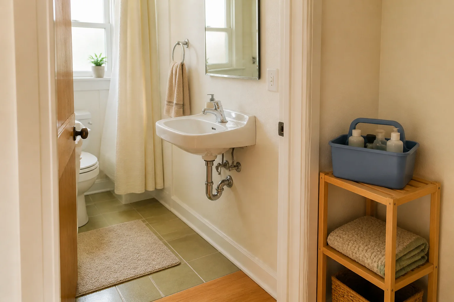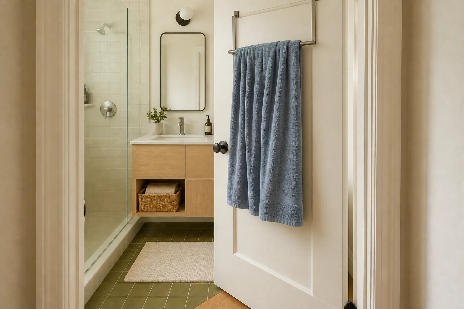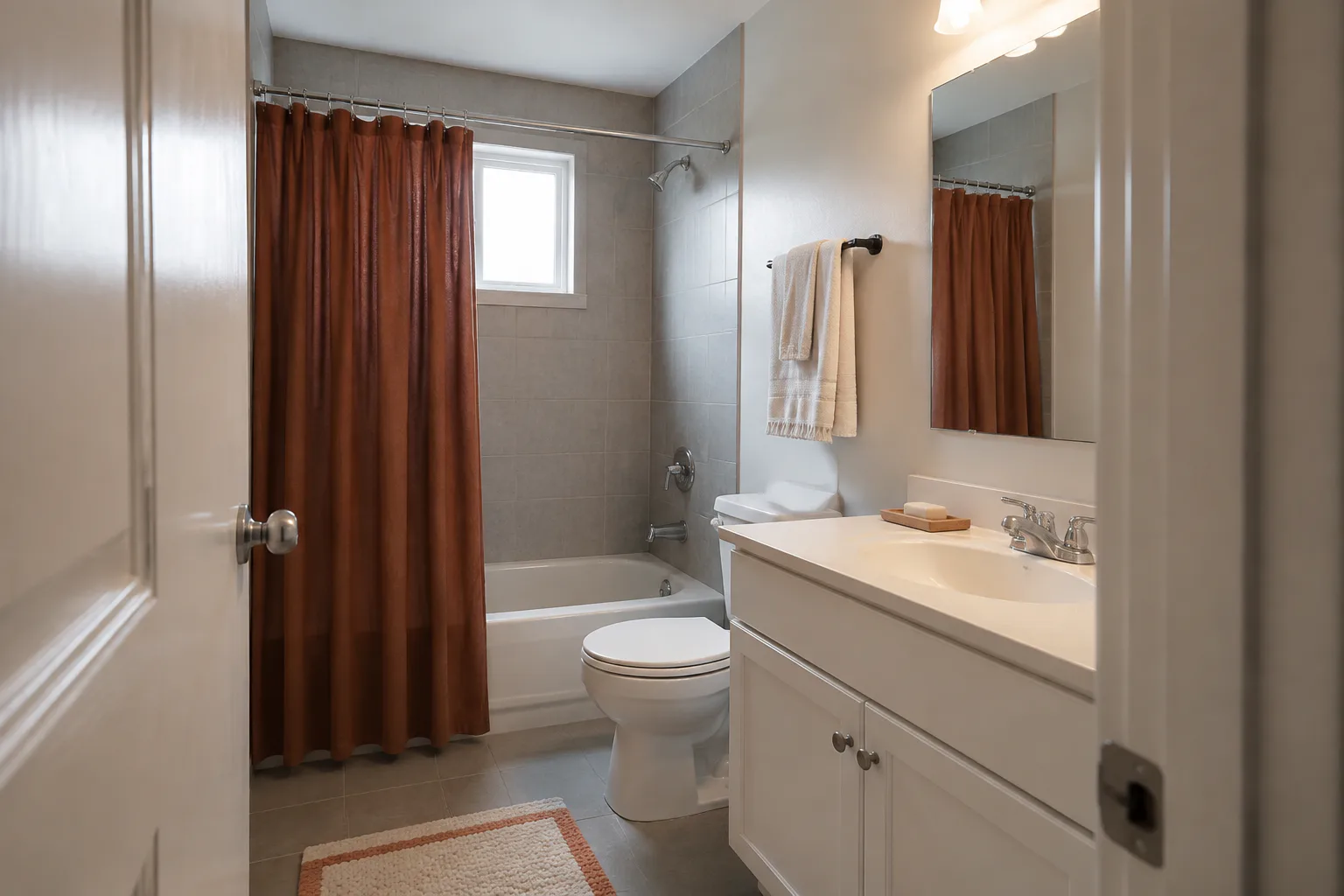
A gray rental bathroom can feel cold even when every finish is sound and clean. Cool blue tile can sit beside a different gray vanity, while a single overhead light flattens both. A matching accessory set will not necessarily pull those pieces together. It may only give you more things to clean around.
Start with the finishes and restrictions that cannot change. Look at the room under the light you actually use. Then choose one warm color that works with the fixed surfaces and test it on the largest removable one. Repeat that color in one or two useful places. The goal is a deliberate palette that still looks like the bathroom you started with.
Jump to a section
- Separate a decorating problem from a maintenance problem
- Read the fixed bathroom before choosing a color
- Check the gray under the light you actually use
- Choose one bridge color, not a whole new scheme
- Test the largest removable surface first
- Repeat the color through useful layers
- Keep warmth from turning into clutter
- Treat semi-permanent updates as separate decisions
- Live with the palette before buying the rest
01
Separate a decorating problem from a maintenance problem
Do not decorate over a water or ventilation problem. Recurring growth, dampness, damaged finishes, leaks, or a failed exhaust fan need attention before a new curtain or print goes into the room. The same applies to a musty odor that keeps returning.
The U.S. Environmental Protection Agency says moisture control is central to controlling mold and advises renters to report plumbing leaks and moisture problems promptly. Its guide to mold and moisture also recommends running the bathroom fan or opening a window while showering when that is practical. A decorative covering does not correct the moisture source behind a damaged surface.
Check what your lease and landlord allow before making changes. Painting a wall is a different decision from replacing fixed hardware, covering tile, or mounting art. Permission for one does not cover the others. Keep a written record of any approval that may matter at move-out.
02
Read the fixed bathroom before choosing a color
Stand at the doorway and note the surfaces that take up the most space. Start with the wall tile, floor, tub or shower surround, and vanity. The countertop, painted wall, and mirror may also carry a lot of visual weight. Then look at smaller finishes such as chrome, brushed nickel, black metal, brass, or wood.
One of the large surfaces usually controls the room. It may be a blue-gray floor, a violet-gray wall tile, or a brown-gray vanity. The undertone does not have to be named perfectly. You only need to compare possible colors beside the real surfaces and notice which ones make the fixed finishes look clearer rather than muddier.
Clear away unrelated decor while you look. Keep what you use every day, but temporarily remove small pieces that complicate the color decision. If the sink has no usable surface, more containers will not help. The routine-first approach in our guide to bathrooms with no counter space will help you decide what genuinely needs to remain near the basin.
03
Check the gray under the light you actually use
A color that looks warm on a phone screen can turn dull or unexpectedly pink beside your tile. Bring fabric, paint cards, or large sheets of colored paper into the bathroom. Hold each option near the floor and vanity, then beside the shower surround. Look again in the morning and at night.
Electric light changes the room, but "warm bulb" is not a complete specification. The U.S. Department of Energy explains that correlated color temperature describes the warm-to-cool appearance of the light. Color rendering index indicates how the source renders colors. Its light-bulb guidance also advises checking LED specifications for enclosed-fixture and dimmer compatibility.
If the fixture accepts a user-replaceable bulb, follow its label and the bulb specifications. If the light flickers, the fixture is damaged, or a change would involve wiring, treat that as a maintenance or electrical question rather than a decorating step.
04
Choose one bridge color, not a whole new scheme
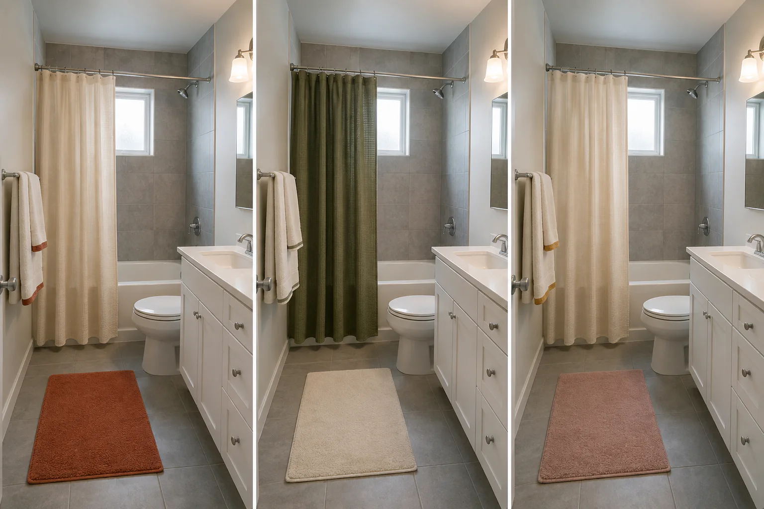
The most useful color connects the fixed gray to something warmer already present or easy to introduce. Muted rust may work beside blue-gray tile. Olive can suit a softer green-gray, while ochre and warm cream may sit comfortably with a brown-leaning gray. Treat these as possibilities, not formulas.
Compare each candidate with at least two fixed surfaces. A terracotta curtain might flatter the wall tile but make the floor look sharply purple. Keep testing until one color makes the main surfaces feel related without requiring every object to match it.
A small windowless room may benefit from a lighter, quieter field rather than a dark curtain covering most of one wall. Plain pale tile may support a deeper color or controlled pattern. Let the actual room decide.
05
Test the largest removable surface first
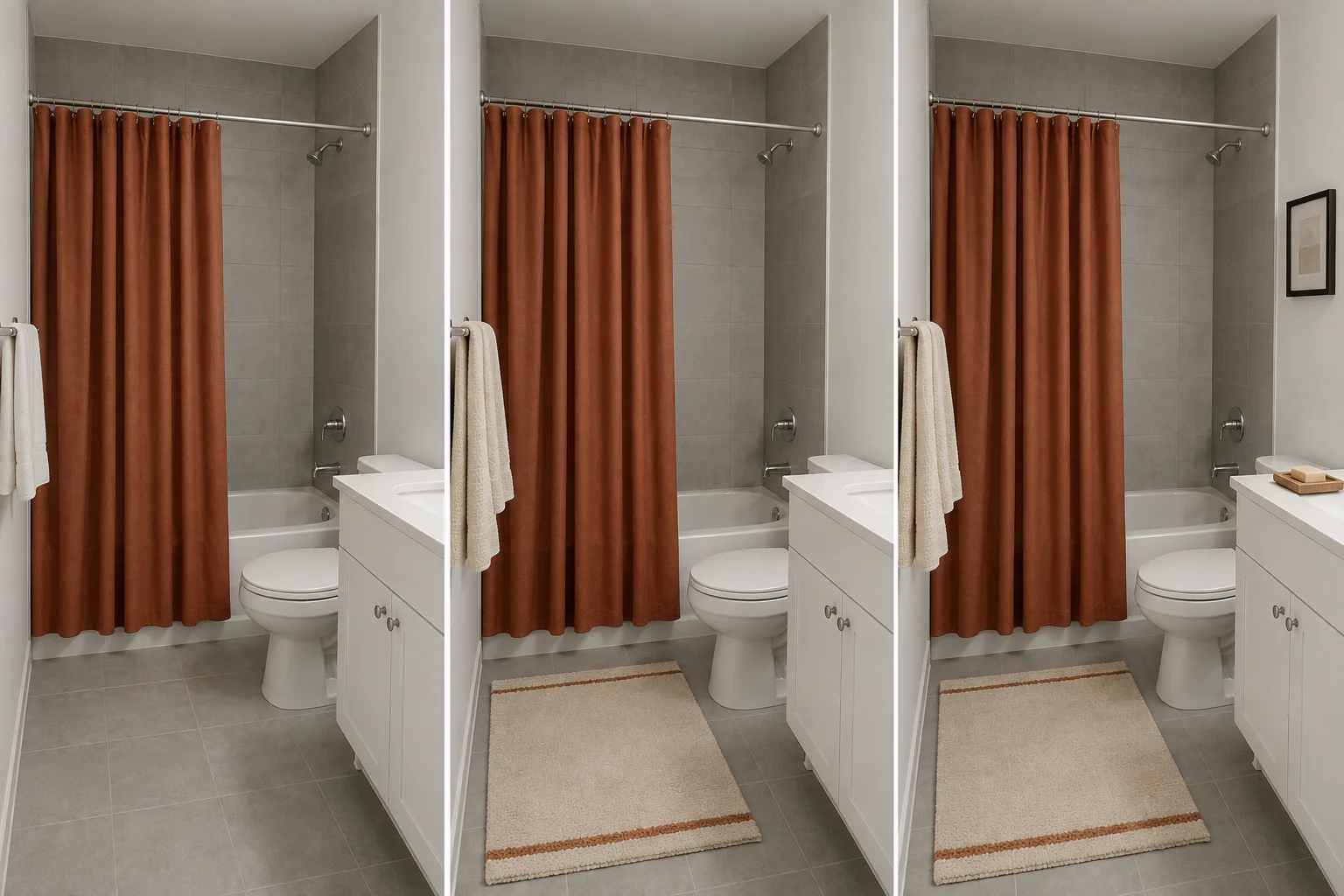
Change one large visual field before buying several accessories. In a bathroom with a tub, that is often the shower curtain. With glass doors, it may be the bath mat, towels, or a substantial piece of art. In a powder room, it might be a hand towel and framed print considered together.
Use something you already own to test the area when possible. A sheet or length of fabric can stand in for the curtain, and folded towels can mark the area of a mat. For art, tape colored paper inside a frame you already have. The stand-in does not need to be beautiful. It only needs to show the amount and position of color.
Judge pattern at full scale. A tiny motif that looks restrained in a product thumbnail can become the busiest surface in the room. A broad stripe or large botanical may read more calmly because there are fewer repeated elements. A solid field leaves more attention on the fixed tile.
If you buy a shower curtain, check its dimensions, care, opacity, liner requirements, and floor or tub clearance. The right color does not compensate for a curtain that drags, stays damp, or leaves part of the opening exposed.
06
Repeat the color through useful layers
Once the large surface works, repeat the bridge color once or twice. Towels can provide a smaller block, a washable mat can connect the curtain to the floor, and art can carry the color at eye level. The pieces do not have to form a coordinated set; a lighter or darker version often looks less staged.
Every layer still has to work in the bathroom. A mat must clear the door and standing space. Towels need a place to dry rather than remaining folded for the palette; if that is the real problem, use our guide to hanging wet towels in a small bathroom before adding more textiles. Put art only where its materials, mounting method, and distance from splashes suit the room.
07
Keep warmth from turning into clutter
A room can feel warmer through color, material, texture, and light. You do not need to put decorative bottles, baskets, candles, and plants on every ledge.
Protect the empty places the room needs. Leave a landing area at the sink. Keep the toilet tank accessible. Do not narrow the route with a freestanding shelf added only to display warm-toned objects. Make sure the shower curtain can move, the mat can dry, and cleaning does not require relocating a collection.
If an item does not support the daily routine or strengthen the palette, leave it out. The gray may feel less severe once the room is no longer broken into many small colors and shapes.
08
Treat semi-permanent updates as separate decisions
Peel-and-stick tile, removable wallpaper, adhesive hooks, painted hardware, and swapped fixtures are often grouped under "renter-friendly." They do not share one risk level or one set of instructions.
Check the lease, exact surface, finish condition, humidity exposure, preparation, removal method, and responsibility for restoration. Even bathroom products have limits: 3M's bath picture-hanging strip page excludes some surfaces and specifies cleaning, temperature, and paint-curing conditions, while instructions for one Command bath hook warn that incorrect use may cause damage. Those details apply only to the named products.
If the room already feels coherent after changing textiles and art, stop there. A successful removable palette is a good reason not to cover the floor or tile. If a semi-permanent change still seems necessary, evaluate it as its own project rather than the next item on a decorating list.
09
Live with the palette before buying the rest
Leave the test arrangement in place for several days. Look from the doorway, during the morning routine, with the lights on at night, and after cleaning. Notice whether the gray feels balanced or simply concealed by a louder color.
Check the practical cost of every change. Does the mat block the door? Do the towels dry? Does the curtain make the shower darker? Can the sink still be used without moving decor?
Keep the pieces that improve both the palette and the way the room works. Return or remove anything that looks good only in a photograph.
Keep the fixed gray and find one warmer color that works with it. Repeat that color sparingly. When you are done, the bathroom should still be easy to use.