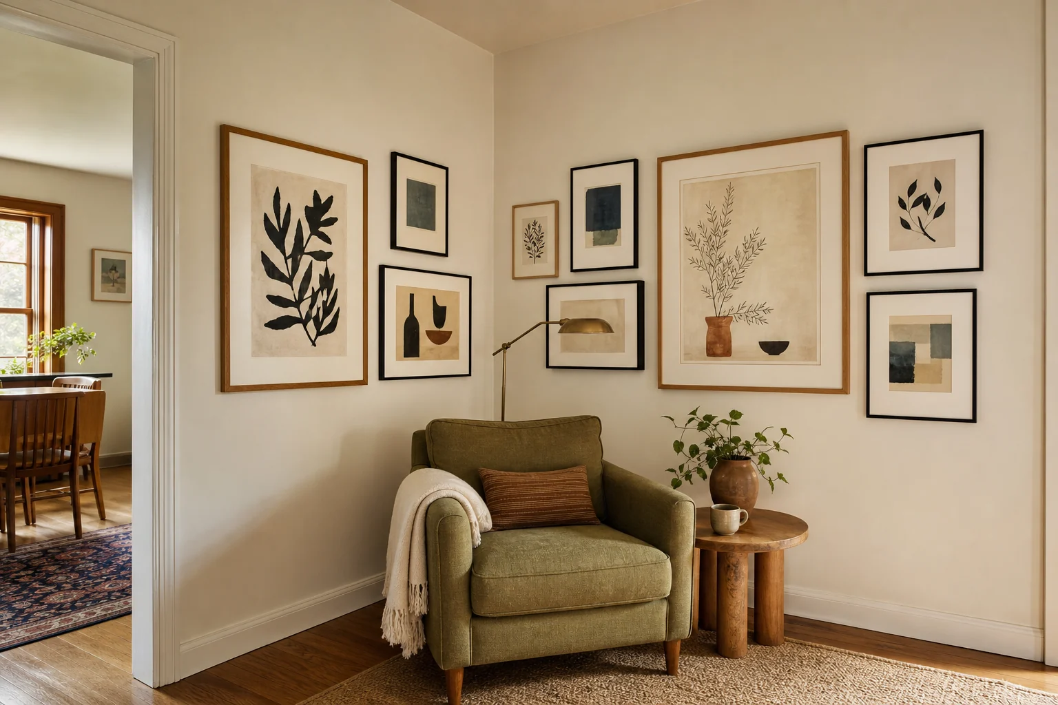
A corner gallery wall can make an overlooked part of a room feel intentional. The trouble usually starts when the frames come first. Once the art is inside them, you discover that the arrangement is too tall for one wall, too small for the other, or awkward above the furniture.
Start with the room. Decide whether the display should wrap the corner, mark the total area it can occupy, and add any art you already own at its real framed size. Only then can you tell whether the missing pieces call for a coordinated set, collected frames, or picture ledges.
The goal is simple: make two walls read as one display without buying more than the room needs.
Jump to a section
01
Decide whether the gallery should wrap the corner
Some corners are better left alone. A wraparound gallery works when both walls belong to the same small zone, such as the corner behind a reading chair, the walls around a compact desk, or the end of a sofa where both planes are visible.
Judge it from the place where you will usually see it. That might be the doorway, the sofa, or the main path through the room. If one wall disappears behind a curtain, cabinet, or open door, extending the display onto it can make the arrangement feel interrupted. When the corner sits near an entrance, the narrow-entryway guide helps protect the door swing and walking route first.
The furniture below matters too. A chair, cabinet, desk, or sofa arm gives the gallery a visual base. Without that relationship, a cluster placed high in an empty corner can appear to float. The furniture does not need to be centered, but the art should clearly belong to the same part of the room.
Keep the gallery on one wall if the other is narrow, mostly hidden, or already occupied by something visually strong. Using the corner should solve an awkward wall, not create another one.
02
Map the full corner gallery wall layout
Measure each wall from the inside corner to the nearest hard edge. Door frames, window trim, curtain stacks, shelves, switches, and short wall returns may limit the composition before the wall itself ends.
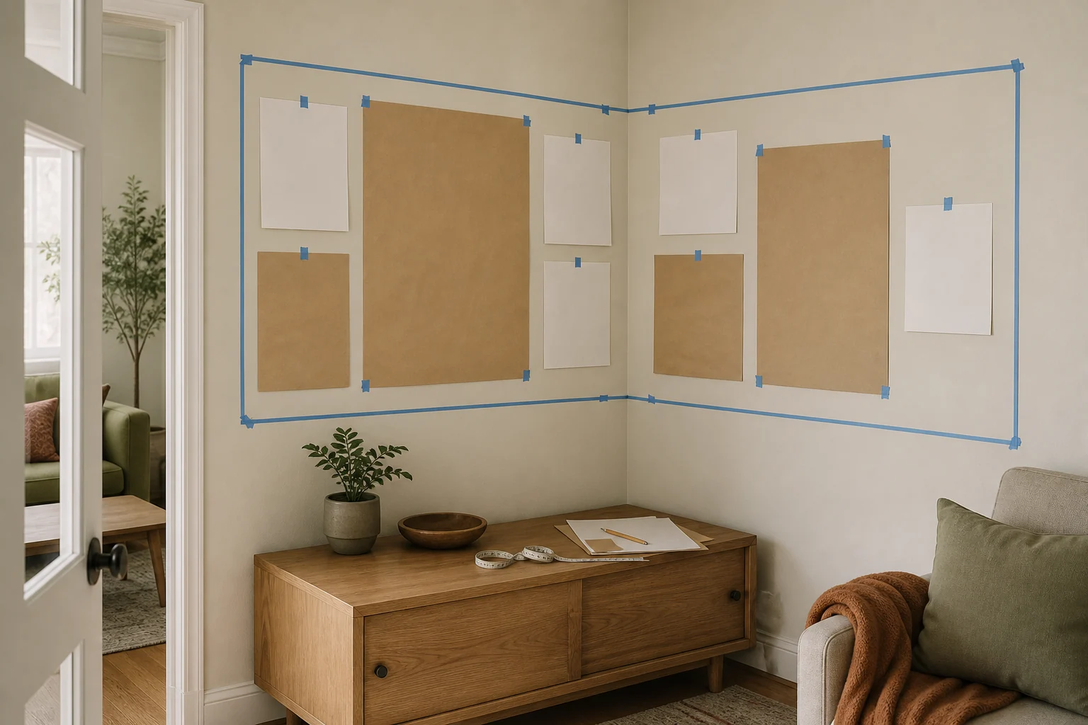
Mark the largest area the gallery could occupy. Think of it as one shape folded around the corner. The two sides can have different widths, but their upper and lower edges should relate closely enough for your eye to follow the display around the turn.
Painter's tape is useful for marking this boundary, but choose tape suited to the surface and test it somewhere inconspicuous first. 3M's surface guide recommends testing tape compatibility before use. Use paper instead if the wall finish is delicate.
Add the pieces you already plan to hang before working out what to buy. Measure the outside of each frame, not the print inside it. An 8-by-10 print occupies more wall once a mat and frame surround it, and two frames made for the same print size can have different outside dimensions.
Include mirrors, plates, textiles, or other objects at full size. Their shape and visual weight affect the arrangement even when they are not frames.
03
Choose the frame route that fits the room
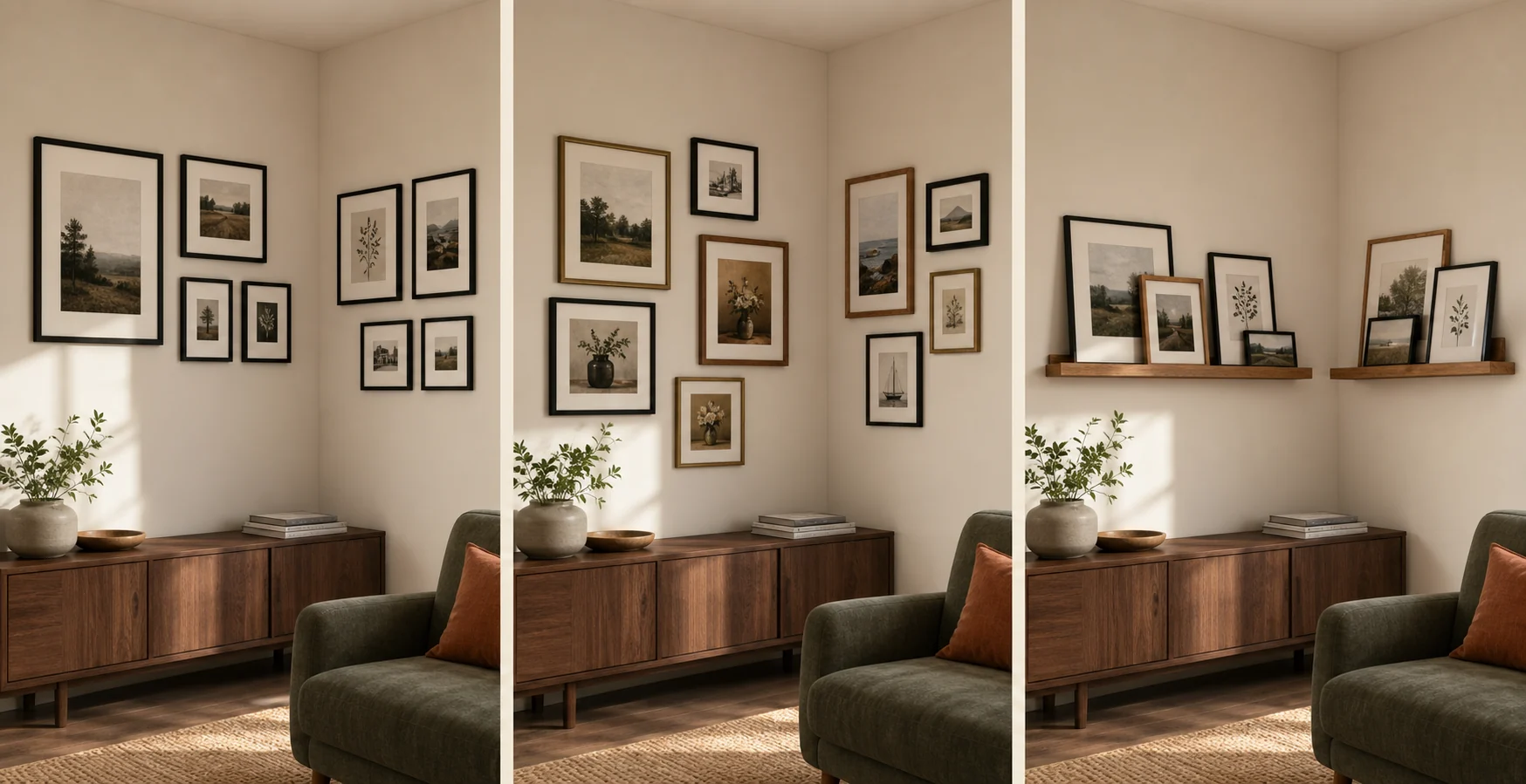
The useful choice is not black versus timber. It is whether your room and art need a coordinated system, an individually assembled collection, or an adjustable ledge display.
A coordinated frame set
A multi-size set suits an orderly composition, especially when your photographs or prints can be prepared for standard openings. Repeated frames can also settle down a group of images that vary widely in color or subject.
The set controls much of the layout, so check every frame's outside dimensions, mat opening, and allowed orientation. Listing photographs can make modest frames look larger than they are.
The Gallery Perfect seven-frame set has one 12-by-16 frame, two 8-by-10 frames, and four 6-by-8 frames. With the supplied mats, their image openings become 8 by 10, 5 by 7, and 4 by 6. The largest frame can act as an anchor while the repeated black finish connects the two walls.
The listing describes engineered-wood frames, clear glass, hanging hardware, and a wall template. Check that template against the hangers on the physical frames before making holes. You should also confirm the selected variant and outside measurements before matching the set to your paper plan.
Individually collected frames
Separate frames make more sense when the gallery starts with art you already own. A large print, a family photograph, and an unusual secondhand piece can each keep the proportions that suit them instead of being forced into a packaged system.
Repeat one element so the corner does not become scattered. It might be a dominant wood tone, mostly narrow profiles, related mat colors, or one finish used on both walls. The frames do not need to match exactly.
This route can grow slowly. Keep a measured photograph or sketch of the boundary so each new frame fills a real gap instead of starting another cluster at the edge.
Picture ledges
Ledges suit a collection that changes often. Frames can overlap, move, and swap without a new wall hole for every adjustment. A ledge on each wall can also establish a shared horizontal line.
They still take up space. Ledges project into the room, need secure mounting, and can feel heavy in a tight passage. Leave enough room near the corner for their end profiles and the leaning frames. The nightstand alternatives guide uses a similar projection check for a wall ledge beside a bed.
The RICHFOCUS 24-inch picture ledges are a possible option when both wall returns can accept that length. The selected walnut set contains two ledges with front lips, so one can continue the display on each side. Amazon's dimension field appears to reverse the length and depth labels; the listing seems to describe a 24-inch run with roughly four inches of projection. Verify the current variant and measurements before buying.
Four inches still matters beside a doorway or in a hallway. Mock up the projection as well as the length, make sure the frame bases fit behind the lip, and choose mounting hardware for the wall and the finished load. If the ledge intrudes into the walking route, use flat wall-hung frames instead.
04
Choose frame sizes before finishes
Work out the size hierarchy before thinking about color. Begin with the largest piece you own, or the one that should carry the most attention. It becomes the anchor, though it does not have to sit at the geometric center.
One or two larger pieces give the smaller frames something to organize around. When every frame is small, filling the marked area takes more objects, more money, and usually more visual noise.
Test the sizes with empty paper templates. Write the outside frame size and image opening on each one. A broad mat can give a small image more presence, but the opening still has to suit the art. If the crop removes something important, choose another frame.
05
Make two walls read as one composition
The walls need a visible relationship, not identical arrangements. Mirroring the frame count can work in a formal room, but balance does not require symmetry.
Carry at least one connection around the corner. A similar top line, repeated finish, shared color, or steady spacing rhythm may be enough. Check it from the main viewing position rather than standing directly in front of one wall.
Watch the frames nearest the inside corner. When they crowd the turn, the two displays can look as though they collided. Set them too far apart and the blank corner becomes a stripe dividing the composition. This gap often looks different from across the room.
Balance visual weight instead of counting objects. A dark, wide frame may draw as much attention as several pale narrow ones. A mirror or strongly colored print can do the same. A shorter wall may need only one clear anchor and a supporting piece.
06
Test the layout with full-size paper templates
Cut full-size paper templates for every existing frame and every size under consideration. Mark portrait or landscape orientation, place the anchor pieces first, and work outward without crossing the boundary. The guide to making an eating place in a small apartment uses the same full-size mockup idea for a table and occupied chairs.
Live with the paper version for a while. Look at it while sitting down, entering the room, opening nearby doors or curtains, and using the furniture below. Photograph the most promising arrangements so you can compare small spacing changes without rebuilding them from memory.
Only make the purchase list once the mockup works. Record how many frames you need in each outside size, along with the image openings, orientations, finish, glazing, and hanging method. That turns a vague search for a "gallery wall set" into a list you can check against a listing.
Before hanging, identify the wall construction and weigh each finished frame. Hardware ratings can change with the substrate, so follow the instructions for the exact fastener and wall. Frames above a bed, chair, or another place where someone spends time deserve a more cautious mounting decision than lightweight art over an empty cabinet.
07
Match the decision to the room
In a living-room corner anchored by a chair or cabinet, a mixed collection can spread from one larger piece. The furniture gives your eye a starting point, while repeated finishes connect art gathered at different times.
A bedroom-office corner usually has less usable wall than it first appears. The desk, shelves, and bed all set limits. If the frames would sit above the bed or interfere with the work surface, keep the display on the desk wall or move it elsewhere.
Depth matters most in a hallway or narrow passage. Flat frames usually make more sense there than projecting ledges. Because the gallery will be seen nearby and at an angle, a few legible pieces can feel calmer than a dense wraparound collection.
Choose a coordinated set when the wall and images can adapt to standard sizes. Choose separate frames when the existing art should lead. Use ledges only when easy rearrangement is worth their depth and mounting needs.