Compare 3000K and 4000K against the cabinets and counters you already have. This gives you a warm and a cooler option to judge, without treating either as the right choice for every kitchen. Include 2700K if you prefer a more golden appearance. If both options feel too warm, try a higher setting before replacing a whole set of bulbs.
Choose the color temperature you prefer in the kitchen itself, with the adjoining space in view. Then check whether your preparation area has enough light. A counter can remain shaded under a light you like; a well-lit counter can also sit in a room whose light feels too cold to you.
The color choice, light output and light reaching the counter each deserve a separate check.
01
Choose a starting color temperature, then compare it in your kitchen
Color temperature describes whether a white light looks warmer or cooler. It's expressed in kelvin, shown as K on bulb packaging. Lower numbers look warmer; higher numbers look cooler. Here, "temperature" describes the light's appearance, not how hot the bulb gets.
Use these as comparison points:
2700K
- Appearance to compare
- Warm, with a more golden appearance
- When to include it
- You like warm light or want to compare with a warmly lit adjoining room.
3000K
- Appearance to compare
- Warm white, less golden than 2700K
- When to include it
- You want to start with a warm option and see how it looks on your finishes.
3500K
- Appearance to compare
- An intermediate option between 3000K and 4000K
- When to include it
- The warmer and cooler options both feel a little wrong.
4000K
- Appearance to compare
- A cooler white than 3000K
- When to include it
- You prefer less warmth in the room.
5000K
- Appearance to compare
- A still cooler white, often sold as daylight
- When to include it
- You prefer that appearance and want to compare it in your kitchen.
| Setting | Appearance to compare | When to include it |
|---|---|---|
| 2700K | Warm, with a more golden appearance | You like warm light or want to compare with a warmly lit adjoining room. |
| 3000K | Warm white, less golden than 2700K | You want to start with a warm option and see how it looks on your finishes. |
| 3500K | An intermediate option between 3000K and 4000K | The warmer and cooler options both feel a little wrong. |
| 4000K | A cooler white than 3000K | You prefer less warmth in the room. |
| 5000K | A still cooler white, often sold as daylight | You prefer that appearance and want to compare it in your kitchen. |
These descriptions follow the warm-to-cool scale in Feit Electric's color temperature guide. They are starting points for choosing an appearance, rather than guarantees about visibility or comfort.
Read the Kelvin number as well as the name. Terms such as "bright white" and "daylight" describe product ranges, but they don't tell you how much light a particular bulb emits. A daylight label also doesn't mean the bulb will reproduce the daylight entering your kitchen window.
If your current light looks right, note its Kelvin rating before shopping. You may only need a compatible replacement with a similar appearance. There's no reason to change color temperature simply because another setting is marketed for kitchens.
02
Look at the cabinets, counters and adjoining room together
Judge the light against the largest surfaces you intend to keep. A white wall alone won't tell you whether you like the combination of light, cabinetry, backsplash and countertop.
Imagine a kitchen with cream cabinet doors and a wood counter. Compare the same door and a clear patch of wood under each option. You might like the warmer setting, or find that it makes the palette feel too yellow. The cooler setting might look better to you, yet feel out of place beside the dining area. Cream and wood don't automatically require warm bulbs; judge the combination in the room.
Make the same comparison in a white-and-gray kitchen. Cool finishes don't settle the choice: you may like them under cooler light or prefer a warmer appearance. Our gray rental bathroom guide shows how to test color samples beside fixed gray surfaces under the light you use.
Step into the doorway or adjoining room with the lights you normally use together switched on. A kitchen light that looks good by itself may create a contrast you dislike next to a warm dining pendant. The lights don't all have to be identical, but check how they look together before changing all the kitchen bulbs.
Color temperature also isn't a complete description of how colors will look. The Department of Energy's LED guidance distinguishes the appearance of the light itself from its effect on the colors of objects. If the product lists a color rendering index, or CRI, treat it as separate information; a higher Kelvin number alone doesn't establish better color rendering.
03
Compare settings in the same place before replacing every bulb
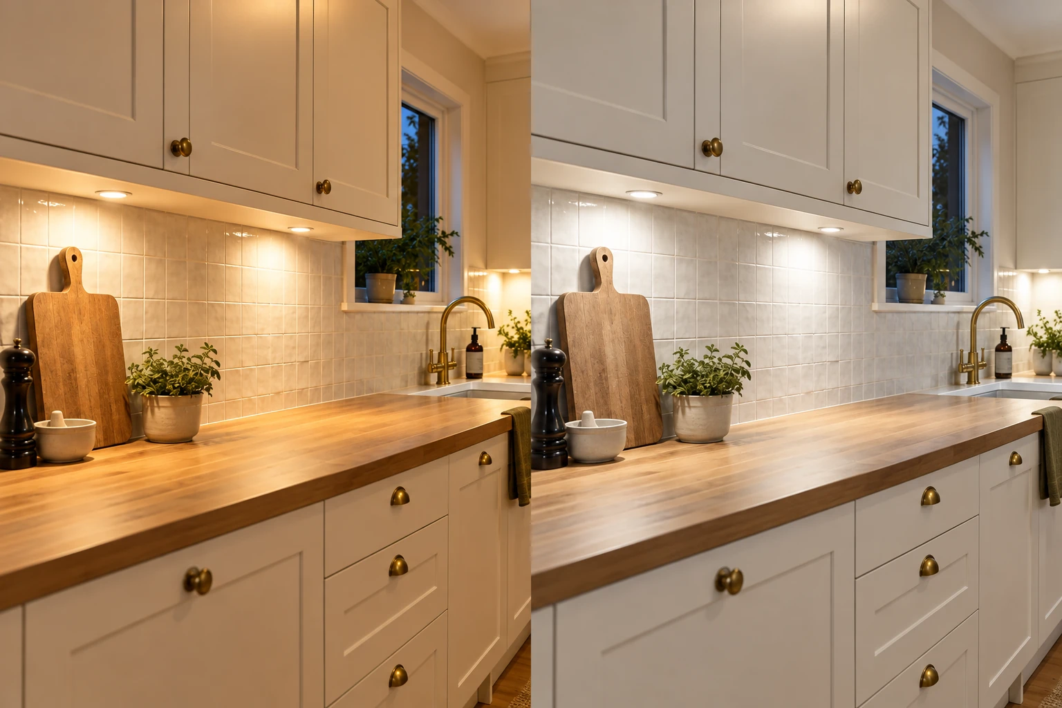
In the comparison above, the left view uses warmer light and the right uses cooler light. Look at the same cabinet doors, backsplash and wood counter in each. These generated views illustrate the appearance change; they don't reproduce exact Kelvin settings or establish equal light output.
Make the comparison at your usual preparation counter and standing position. Keep the other lights and window coverings the same while comparing two settings. Otherwise, it's easy to prefer one option because you also switched on a task light or admitted more daylight.
For a bulb change, use only a fixture intended for user replacement, and follow its instructions for handling and compatibility. Check the required bulb base, size and permitted wattage, along with any enclosure or dimmer requirements. A bulb that offers the color you want still needs to suit the fixture.
A color-selectable light you already own can make this easier. Follow its instructions for changing settings; a selector on the bulb or fixture may require access with the power off. Check whether the manufacturer specifies different light outputs at different settings. Keeping the same fixture doesn't necessarily hold output constant.
Look at the cabinet face, backsplash and counter, then use the space as you normally would. Notice whether you like the appearance while preparing food and when looking into the room from elsewhere. Avoid judging only by looking directly at the lit bulb.
If you first compared the settings during the day, try them again in the evening. Keep the conditions consistent within each comparison; daylight and evening are two different situations. An option may suit both, or daylight may mask a contrast you notice after dark.
Photos can help you remember which setting you tried, but camera white balance and editing can change the colors they show, as Adobe's white balance explanation describes. Make the choice in the room. An online warm-versus-cool image is useful for explaining the difference, but it can't show exactly how either option will look on your own counter.
04
If the counter still looks dim, separate color from output and shadows
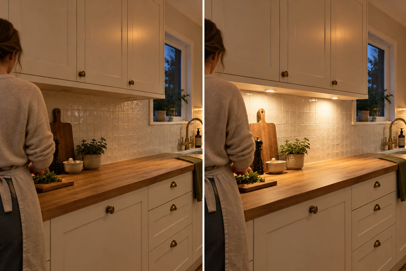
Above, the under-cabinet lights are off in the left view and on in the right. The added light reaches the preparation counter from beneath the cabinets. These generated views illustrate the arrangement, without measuring light levels or promising complete shadow removal.
Stand where you normally prepare food and check the surface, including when your body is between it and the room's main light. You can like the color and still find that this part of the counter looks dim.
The lumen rating tells you a bulb's light output. It doesn't tell you how much of that light reaches your particular worktop. ENERGY STAR's brightness guidance identifies lumens as the measure of output and distinguishes them from watts, which describe power use.
Surface illumination is a separate measure: the light falling on an area. An IES technical article on lighting design explains illuminance as light falling on a surface per unit area and distinguishes it from perceived room brightness. Fixture position, light distribution and objects in the light's path matter alongside output. Two bulbs with equal lumen ratings don't automatically produce equal lighting on a counter, or look equally bright to you.
Use the change that addresses what you observe:
The room looks too yellow or too cool
- What to investigate
- A different color temperature
- What that leaves unresolved
- Whether enough light reaches the preparation surface.
You need more output from the existing source
- What to investigate
- The lumen rating and the fixture's compatible options
- What that leaves unresolved
- Whether the fixture delivers that output where you work.
The worktop is shaded while other areas look well lit
- What to investigate
- Where light comes from and what interrupts its path
- What that leaves unresolved
- Whether you like the color and output of any additional light.
| What you want to change | What to investigate | What that leaves unresolved |
|---|---|---|
| The room looks too yellow or too cool | A different color temperature | Whether enough light reaches the preparation surface. |
| You need more output from the existing source | The lumen rating and the fixture's compatible options | Whether the fixture delivers that output where you work. |
| The worktop is shaded while other areas look well lit | Where light comes from and what interrupts its path | Whether you like the color and output of any additional light. |
For example, suppose the main light is behind you when you stand at the counter. Choosing a cooler bulb changes its appearance, but leaves the source in the same place. If your body interrupts that light, investigate lighting that reaches the worktop from another position. A DOE-sponsored residential lighting guide discusses under-cabinet lighting for counter shadows cast by the person working there. An existing under-cabinet light may already help; check it before assuming you need another fixture.
Some kitchens need more than one adjustment. A task light can improve the lighting arrangement yet have a color you dislike beside the ceiling light. A higher-output bulb may help an otherwise suitable fixture without resolving an obstruction. Check each change at the same work surface to see what it improves.